2023
Redesigning a Hospital Call Center Platform
Role
UX/UI Designer
Timeline
2 months
Team
QA analysts, call center operators, developers
Key impact
Availability check
5 → 2
Steps reduced, eliminating 3 clicks and a mandatory expand/collapse
Eliminated external note-taking by introducing in-context notes directly in the workflow
✶
Reduced visual overload during calls by removing unnecessary alerts and improving text scannability
Aligned the interface with real operator behavior, reducing unnecessary navigation
Improved decision-making speed through a clearer alert hierarchy during live calls
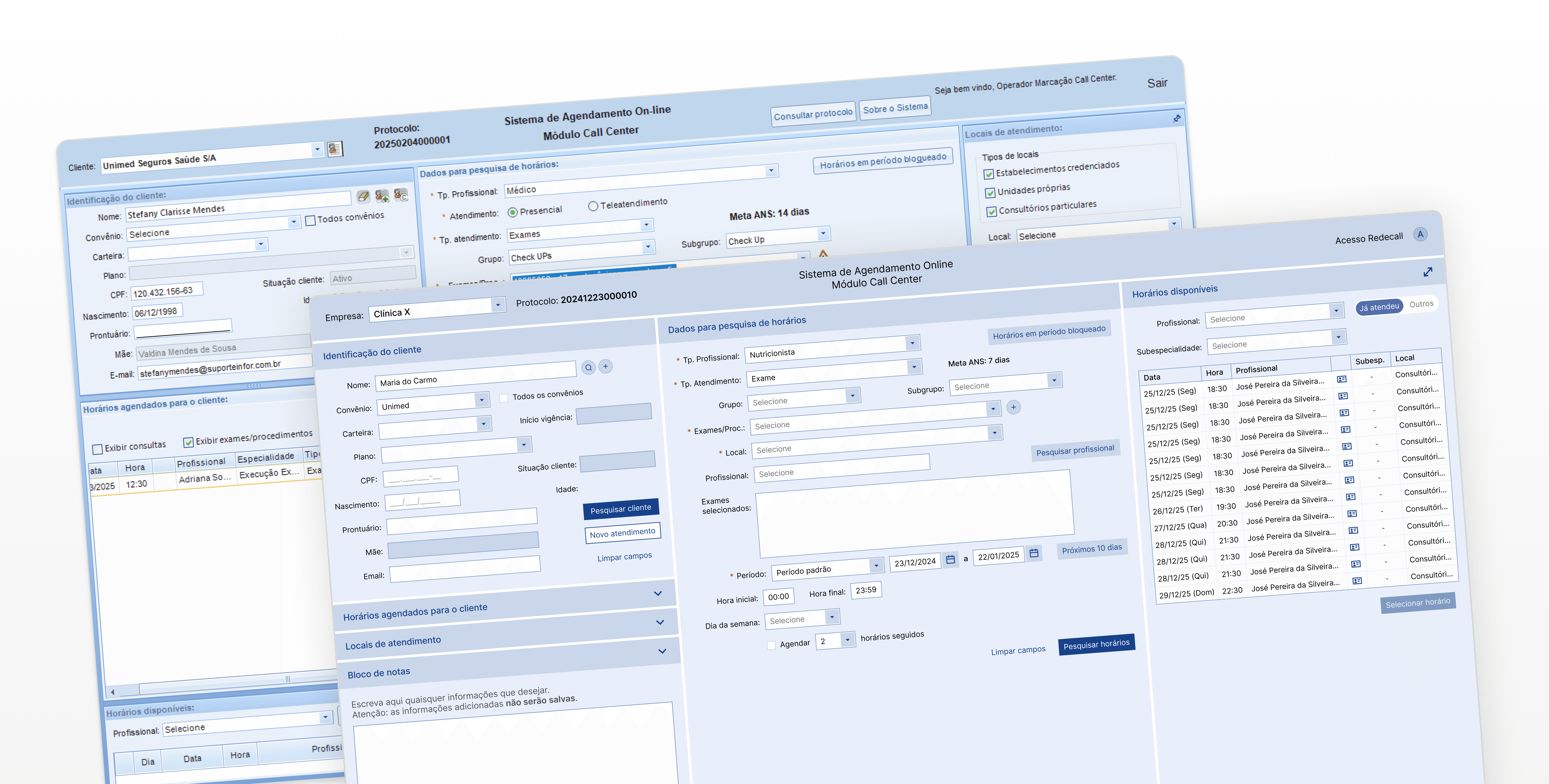
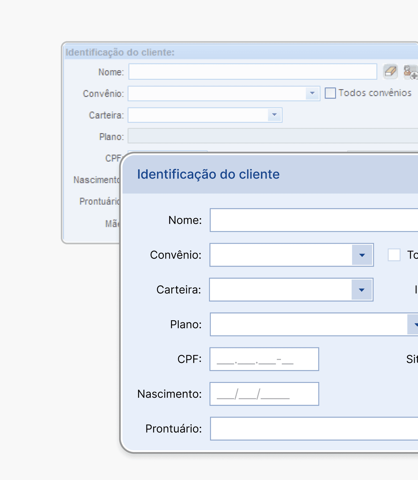
The redesign focused on reducing workflow friction rather than only modernizing the interface
Context
The project began as a visual redesign request during the company’s transition from a downloadable desktop software to a web-based platform used by hospital call center operators to schedule consultations and exams.
However, after analyzing the workflow alongside QA analysts and operators, it became clear that the main issues were not purely visual.
Operators handled a high volume of calls while:
Switching between multiple screens
Taking notes outside the platform
Re-entering patient information
Navigating overloaded alerts in real time
Rather than focusing only on UI modernization, the project shifted toward improving the operational workflow itself — reducing friction, unnecessary steps, and cognitive load during calls.
Understanding the workflow
To understand how the platform was actually used during live calls, I visited the call center and observed operators handling consultations and exam scheduling in real time.
Rather than relying only on stakeholder assumptions, I analyzed how operators navigated the system under pressure while managing patient conversations, internal processes, and scheduling constraints simultaneously.
I also collaborated with QA analysts and spoke directly with operators to better understand recurring friction points and workflow patterns.

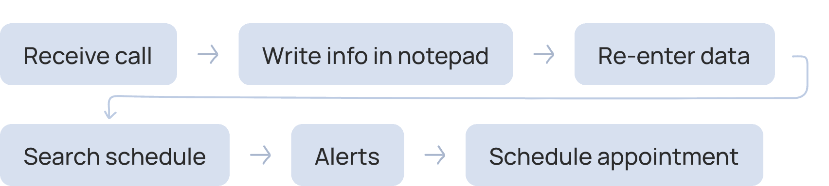
Contextual observation revealed interruptions and workaround behaviors throughout live calls
Key findings
Operators relied on external notes
Because the platform didn’t support quick contextual note-taking, operators frequently wrote information on paper or external tools during calls.
Important alerts competed for attention
Multiple warnings and notifications appeared simultaneously, making critical information harder to identify quickly during conversations.
Repetitive data entry slowed the workflow
Even simple availability checks often required operators to repeatedly enter the same information throughout the process.
The system structure didn’t match the real call flow
Operators naturally followed a different sequence than the one imposed by the platform, leading to unnecessary navigation and interruptions during calls.
Defining the problem
The discovery phase revealed that the platform’s main usability issues were rooted less in visual design and more in workflow friction.
Operators were forced to adapt their behavior around system limitations, creating interruptions during calls and increasing cognitive load throughout the scheduling process.
The redesign therefore focused on improving operational efficiency by:
Reducing unnecessary navigation
Supporting more flexible task flows
Minimizing repeated data entry
Making critical information easier to identify during live calls
Key design decisions
Flexible data entry
Problem
Operators frequently needed to move between different parts of the workflow during calls, but rigid system validations and navigation patterns interrupted the scheduling flow.
Decision
Although certain system dependencies couldn’t be removed, improvements to field organization, navigation, and information access helped better support real operator workflows.
One example was the insurance selection flow. Instead of forcing operators to manually scan long lists, I introduced search functionality to make information retrieval faster during calls.
Why it mattered
These changes reduced interaction friction and better aligned the experience with the fast-paced way operators naturally handled scheduling conversations.
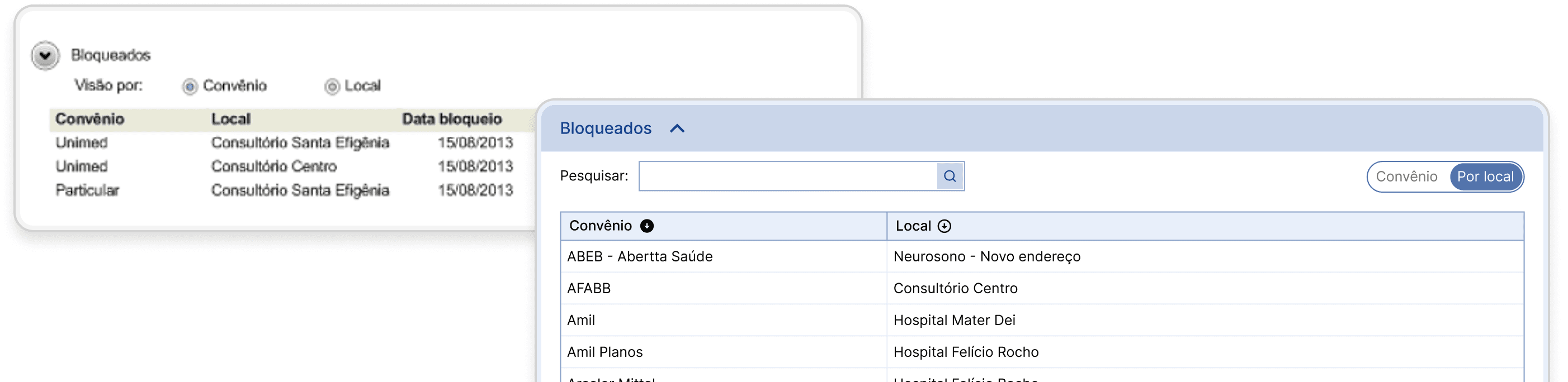
Search reduced manual scanning during time-sensitive calls
In-context note-taking
Problem
Operators frequently relied on external tools or paper notes because the platform didn’t provide a fast way to store temporary information during calls.
Decision
I introduced an in-context notepad directly inside the workflow, allowing operators to quickly write and reference information without leaving the platform.
Why it mattered
Keeping notes inside the system reduced context switching and supported faster, more organized call handling during high-volume scheduling tasks.
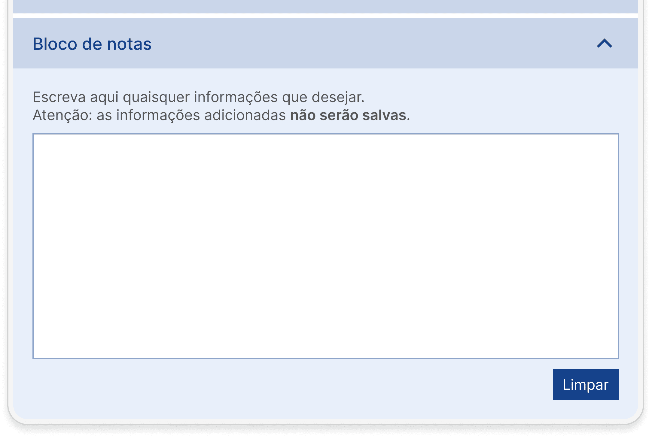
Integrated note-taking reduced reliance on external tools during calls
Workflow restructuring
Problem
The platform’s structure reflected system logic rather than the actual sequence operators followed during calls, creating interruptions and unnecessary back-and-forth navigation.
Decision
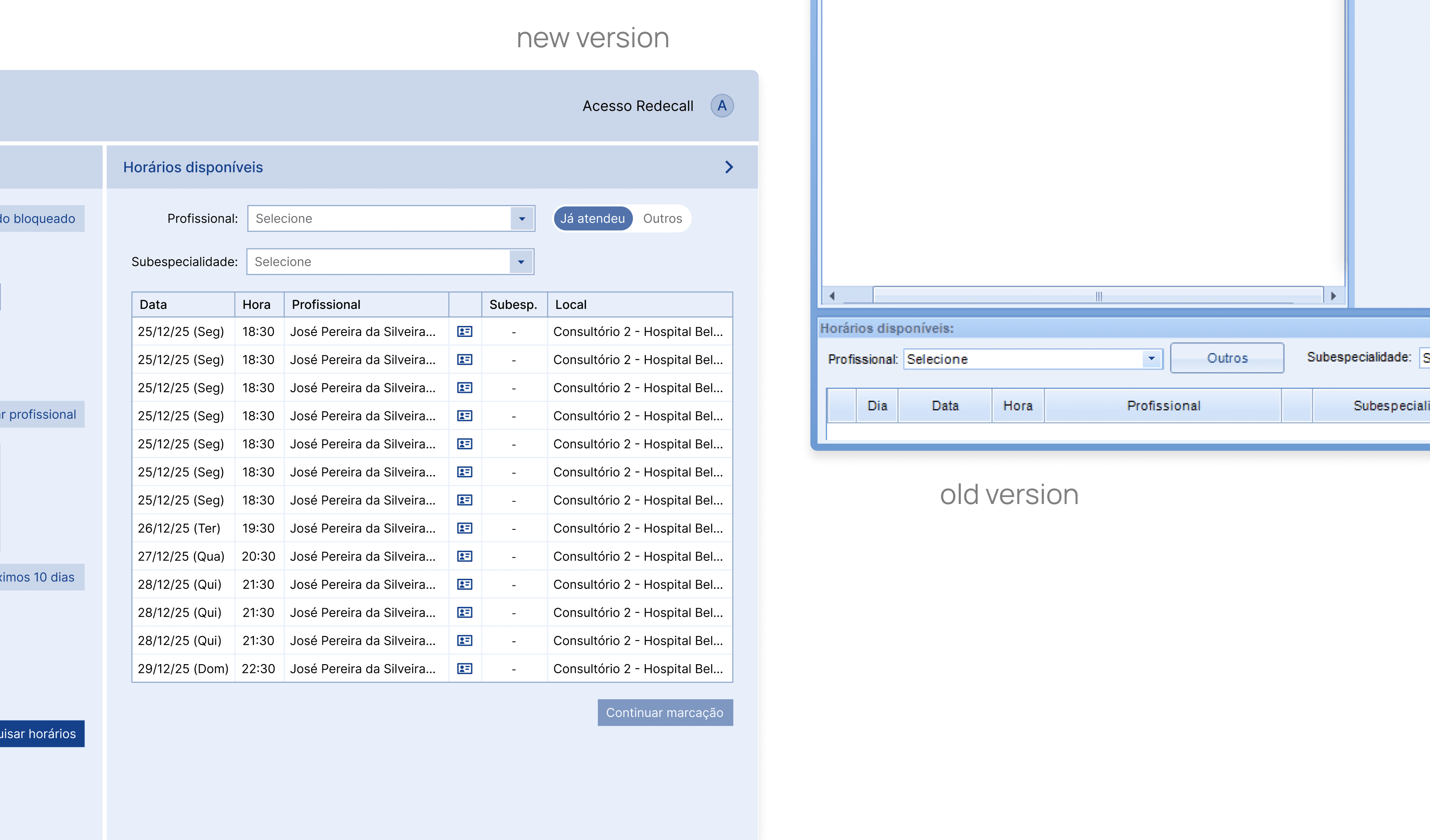
I reorganized parts of the workflow to better align with the natural progression of operator conversations and scheduling tasks.
Why it mattered
Aligning the interface with real operator behavior reduced friction during calls and created a more efficient and intuitive scheduling experience.
Alert prioritization
Problem
Operators were exposed to multiple competing alerts and warnings throughout the workflow, making critical information difficult to identify quickly during live calls.
Decision
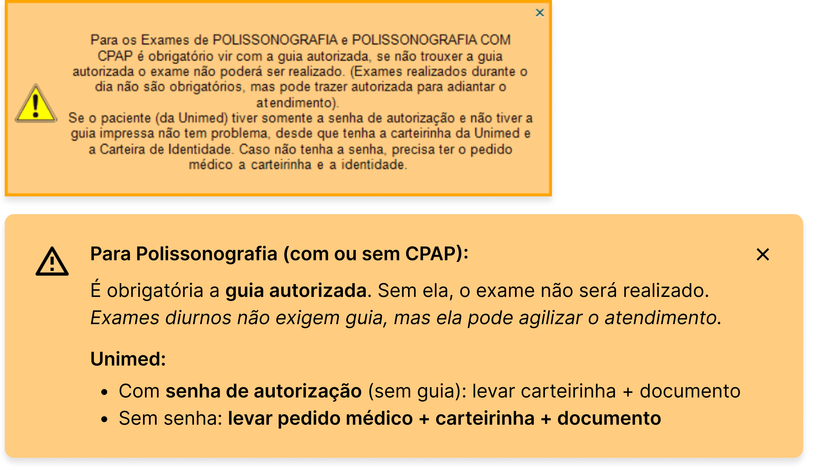
I revised the hierarchy and presentation of alerts to improve visibility and reduce visual overload, helping operators focus on the most important information first.
Why it mattered
Improving alert clarity reduced cognitive load and supported faster decision-making in high-pressure scheduling scenarios.

Constraints & implementation
Many of the workflow limitations were tied to existing hospital system dependencies and validation requirements that couldn't be fully removed during the redesign process. Because of this, the project focused on reducing friction within those constraints.
The most visible improvements after implementation:
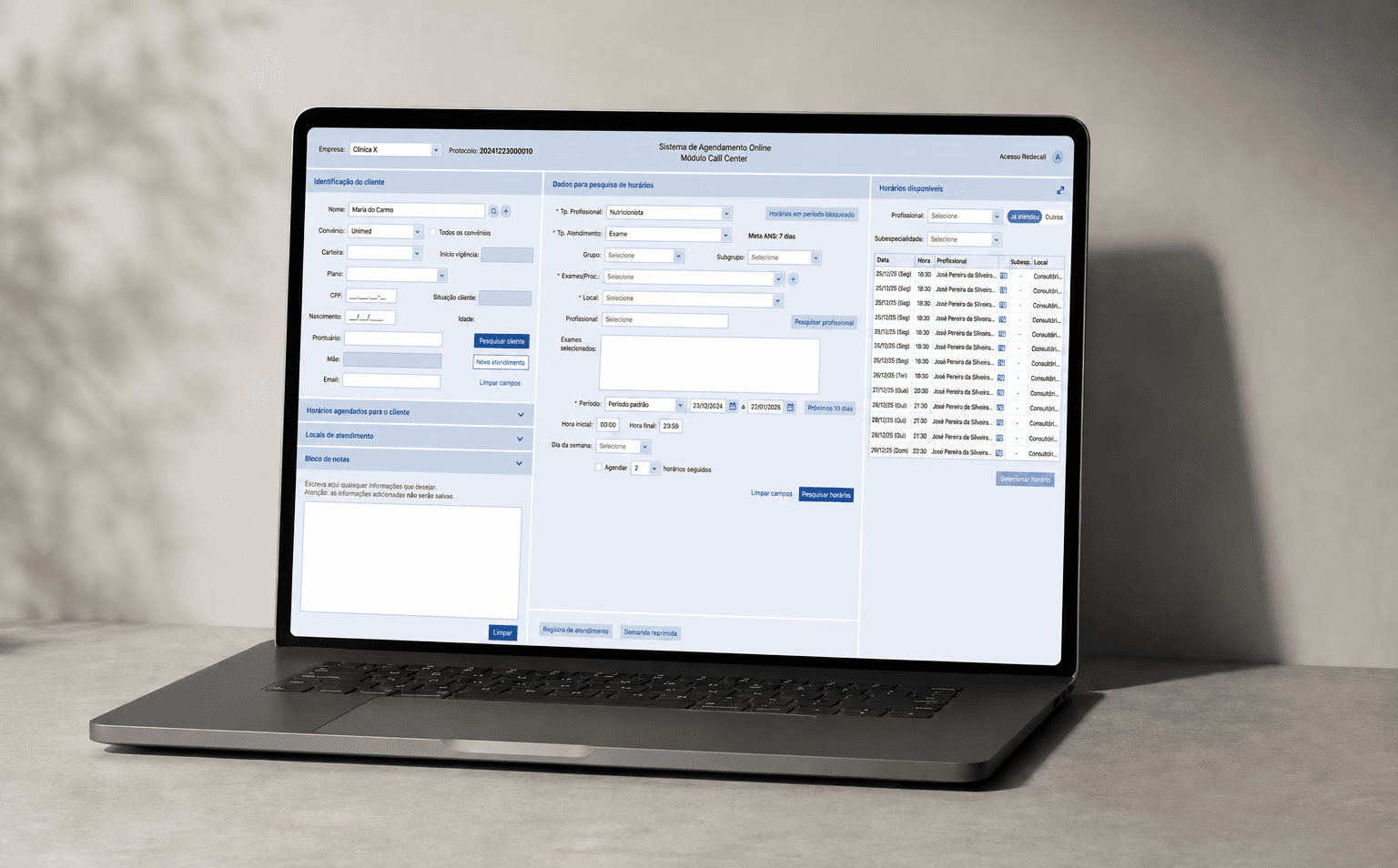
Availability checks were reduced from 5 steps to 2, removing 3 clicks and a mandatory expand/collapse interaction
Most operators stopped relying on paper or external tools once the in-context notepad was introduced, keeping information inside the workflow during calls
Removing alerts tied to deprecated interactions — such as spacebar selection prompts — and reformatting text for better scannability significantly reduced visual noise throughout the flow
Reorganizing key sections to match the natural progression of operator calls reduced unnecessary back-and-forth navigation
Reflection
This project highlighted the gap that can exist between how systems are designed and how they are actually used in practice.
Observing operators in their real working environment revealed workflow behaviors and constraints that wouldn’t have been visible through interface reviews alone.
It also reinforced how small improvements in flexibility, navigation, and information access can significantly reduce friction in high-pressure operational environments like call centers.