2024
Role
Research, UX strategy & validation
Timeline
~6 months
Team
Key impact
Research
60+
Usability sessions conducted across new users, beta testers, and public users over 6 months
Reduced onboarding friction for non-technical users
Users reached expected outcomes with fewer prompt iterations
Improved discoverability throughout the platform
Shifted decisions from assumptions to user-driven insights
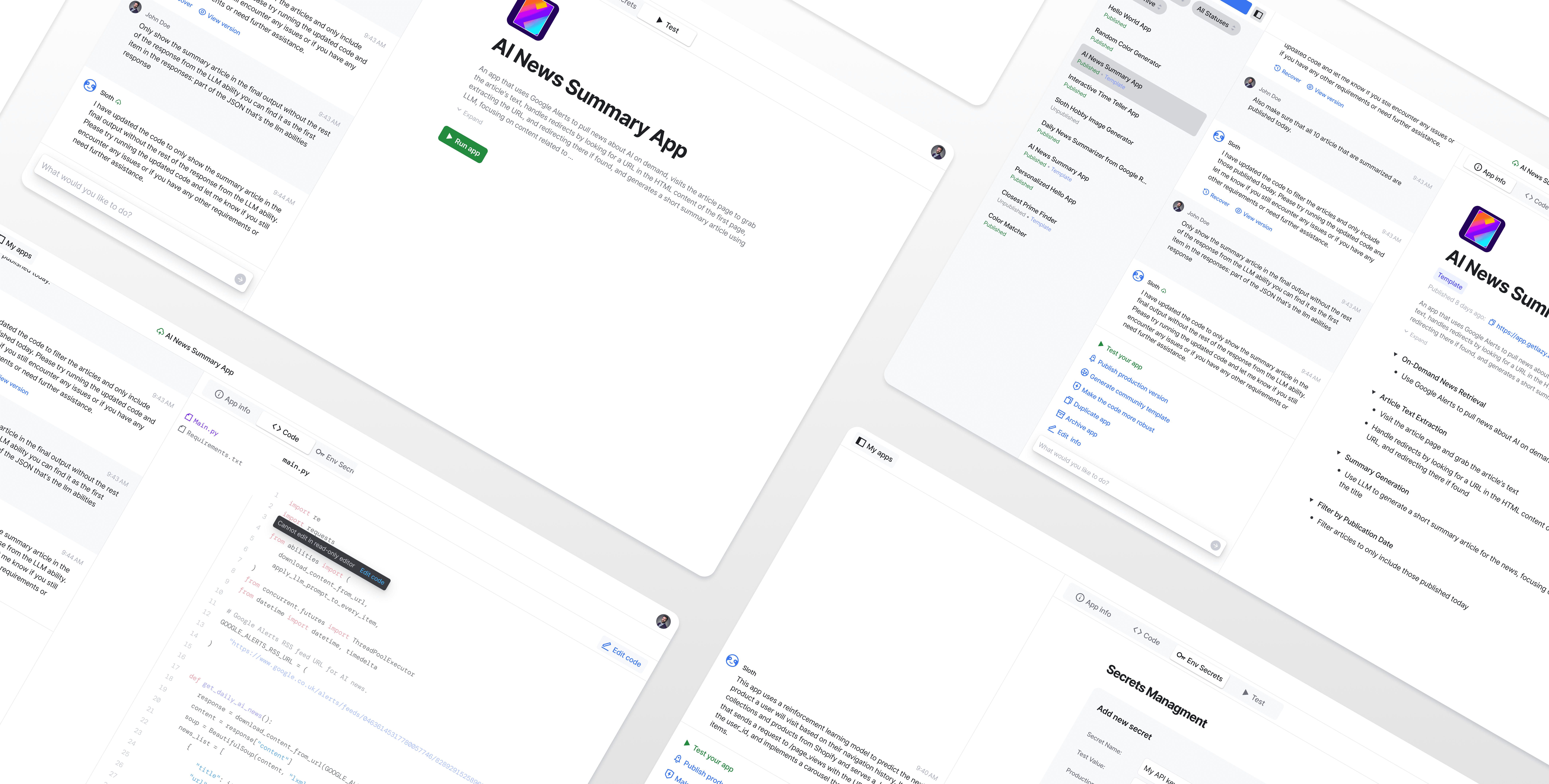
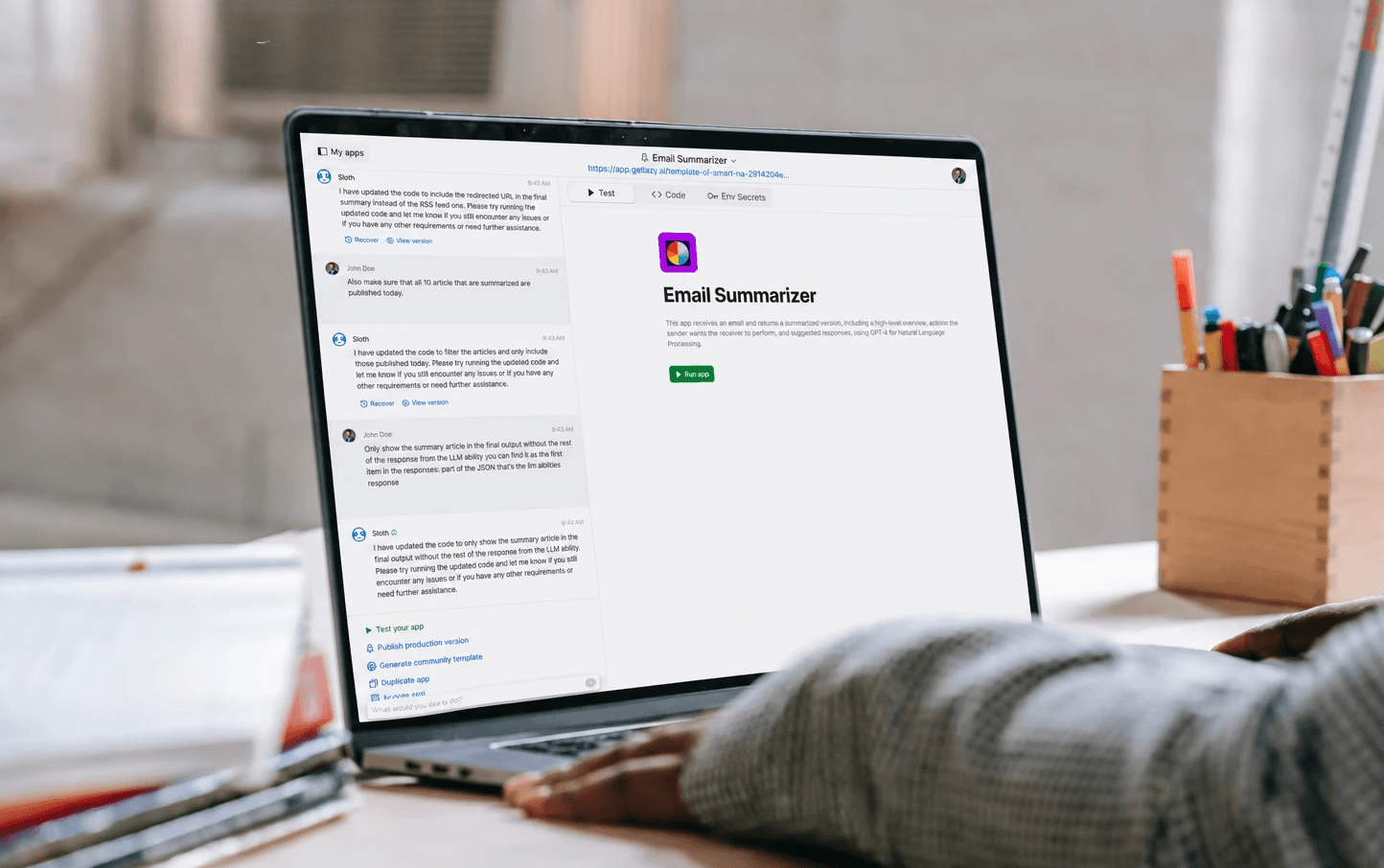
Overview of the prompt-based no-code platform and its conversational app-building workflow
Context
The project focused on improving the usability of an AI-powered no-code platform that allowed users to build applications through prompt-based interactions.
At the time, the company was in its early stages, initially releasing the product to friends and family before expanding to beta testers and public users.
As adoption grew, I advocated for introducing UX research into the product process — recognizing that without direct observation of how non-technical users interacted with the platform, the team would be making decisions based on assumptions rather than behavior.
My proposal was accepted, and from that point I ran ongoing usability testing and user interviews throughout the product's growth, helping the team make more informed decisions at every stage.
Discovery & research
I conducted usability sessions with new users, beta testers, and public users — observing how they interacted with the platform in real time rather than relying on self-reported feedback.
It's worth noting the timing: this was 2022–2023, when AI-powered tools and prompt-based interactions were just emerging. Most users had little to no prior experience with ChatGPT or similar products, so there was no established mental model to build on. Users were encountering this type of interaction for the first time, which shaped almost every friction point we observed.
A consistent pattern emerged across sessions: the platform had been built by a technical team with a technical mindset, while the people using it had none of that context and no reference point for how to interact with it.
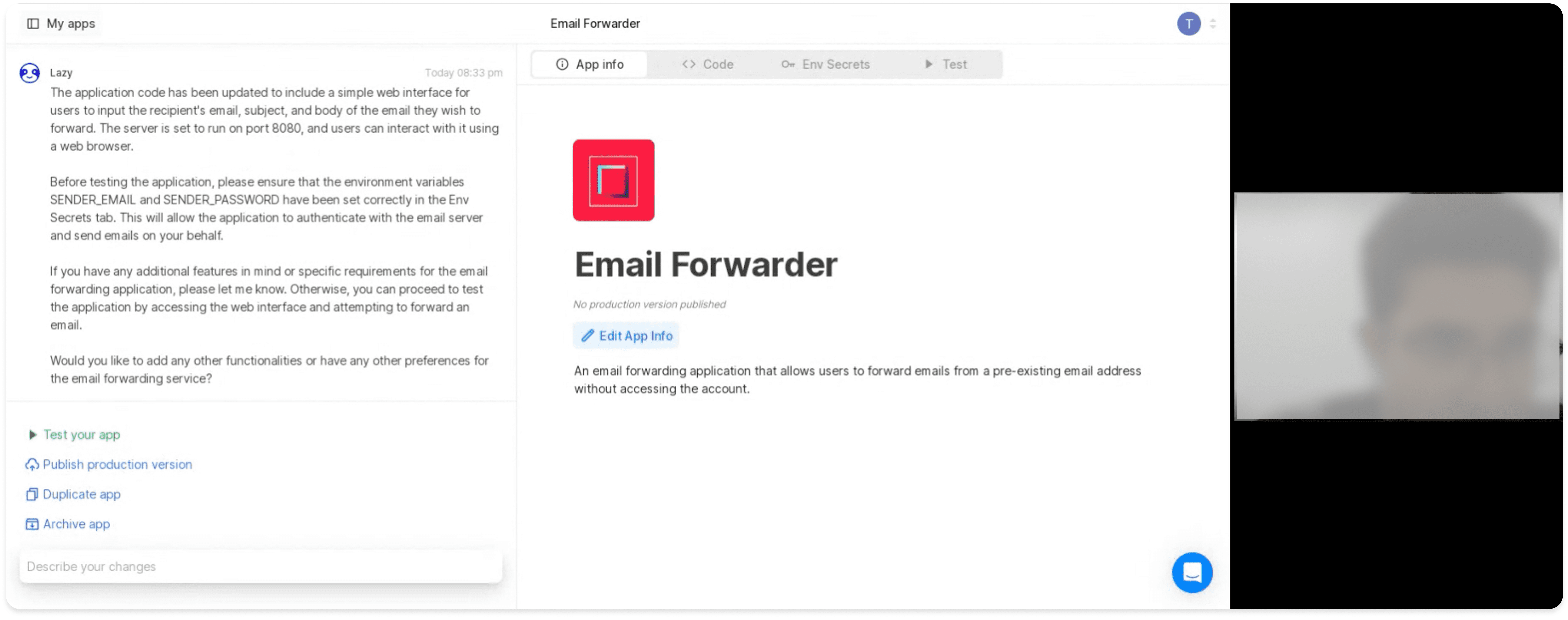
Usability testing session with new users
Key findings
System responses were too technical to act on
When the platform responded to a prompt, the language it used was often too technical for non-technical users to understand. Users didn't know what the response meant, what had changed, or what to do next.
Button and feature names didn't match how users thought
Labels throughout the interface reflected internal product terminology. Users couldn't connect the names they saw to the actions they wanted to take.
Basic tasks weren't discoverable
Simple actions like renaming a project were not intuitive and users frequently couldn't find them — even when they knew what they wanted to do.
Users didn't know where to start
Facing a blank prompt with no guidance created paralysis, especially for users who had never interacted with a prompt-based tool before. There was no clear entry point.
Users couldn't track what changed after each prompt
After sending a message, users had no way to see what had actually changed in their project. They couldn't review the last update, compare it to a previous state, or go back if the result wasn't what they expected.
Problem definition
Problem
The usability issues weren't isolated interface problems — they stemmed from a fundamental mismatch between the system's technical mental model and how non-technical users expected AI-driven interactions to work.
Hypothesis
If we reduced terminology friction, improved feedback visibility, and gave users more guidance during prompt interactions, users would build a clearer mental model of the platform and complete tasks with fewer failed attempts.
Direction
Rather than focusing on new features, the design direction prioritized reducing ambiguity, strengthening system feedback, and helping users understand what the platform was doing at every step.
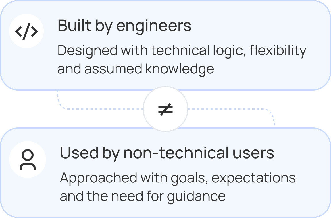
Mental model mismatch
Design recommendations
Rather than redesigning the platform from scratch, my role focused on translating usability insights into improvements that could better support non-technical users while fitting the realities of an evolving startup product.
The recommendations focused on reducing ambiguity, improving system communication, and helping users better understand how to interact with AI-driven workflows.
Clarifying system responses and language
Problem
The platform's responses and interface labels used technical language that non-technical users couldn't interpret or act on.
Recommendation
I worked with the team to rewrite system responses in plain language and rename buttons and features to reflect how users naturally described tasks. Where relevant, responses now also directed users to the specific tab or feature they needed to interact with next.
Expected outcome
Make the platform feel accessible and reduce the moment of confusion that followed almost every system response.
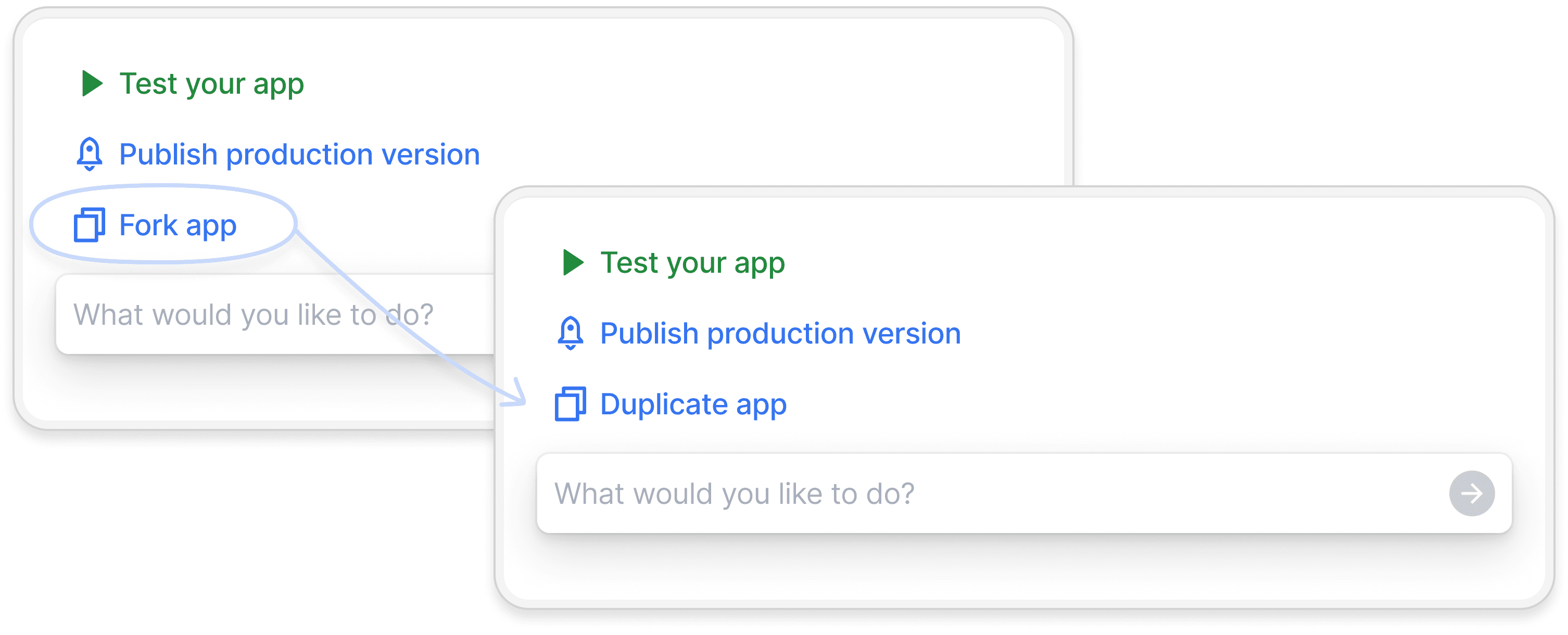
Replacing technical terminology reduced onboarding friction for non-technical users
Making changes visible and reversible
Problem
After each prompt interaction, users had no way to see what had changed in their project, compare it to a previous state, or undo an unexpected result.
Recommendation
We built the ability to view the changes made after the last message, browse the full conversation history, and revert to any previous point in the session.
Expected outcome
Give users a sense of control and safety — reducing the fear of making irreversible mistakes that was causing many to abandon interactions mid-flow.
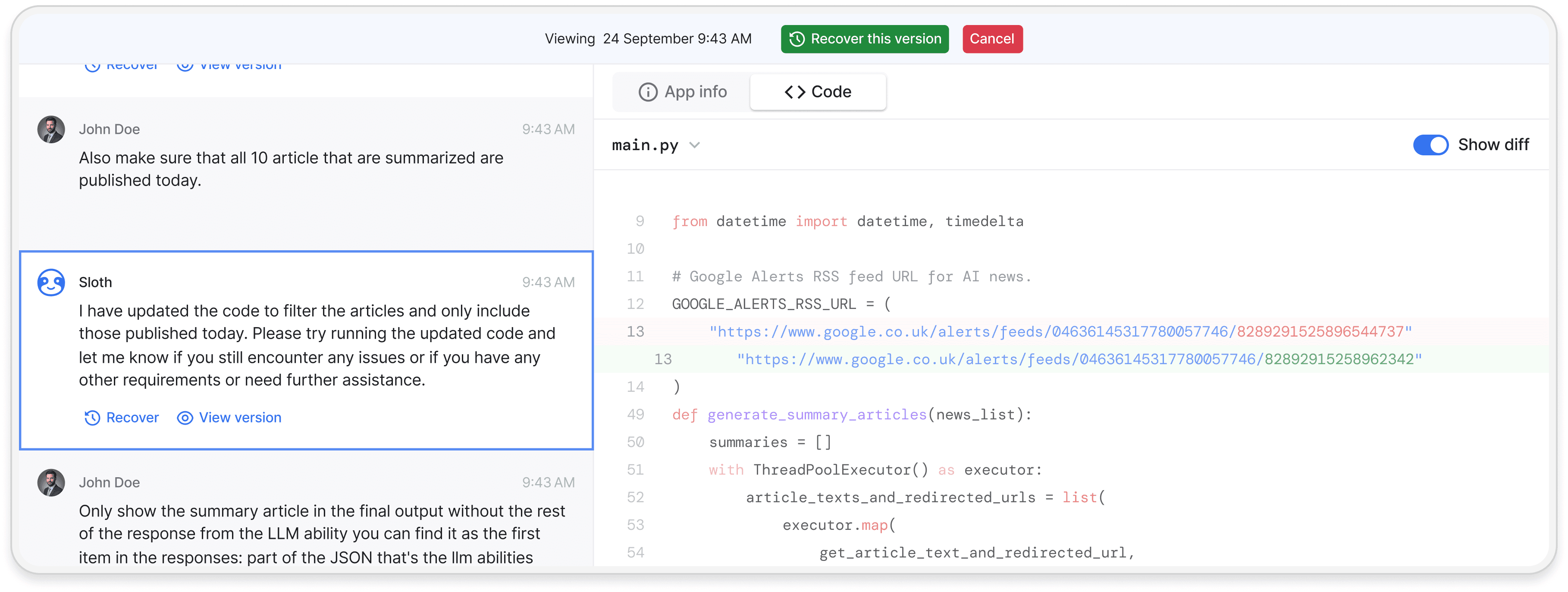
Users could review generated changes, understand what was modified, and recover previous versions when needed
Reducing blank-state friction
Problem
Users had no starting point and froze when faced with an empty prompt interface, especially given that most had never used a prompt-based tool before.
Recommendation
We introduced prompt suggestions to guide users toward their first interaction, and created templates — previously built apps that users could copy and continue building on or use as-is.
Expected outcome
Lower the barrier to getting started and give users a tangible reference for what the platform could do.
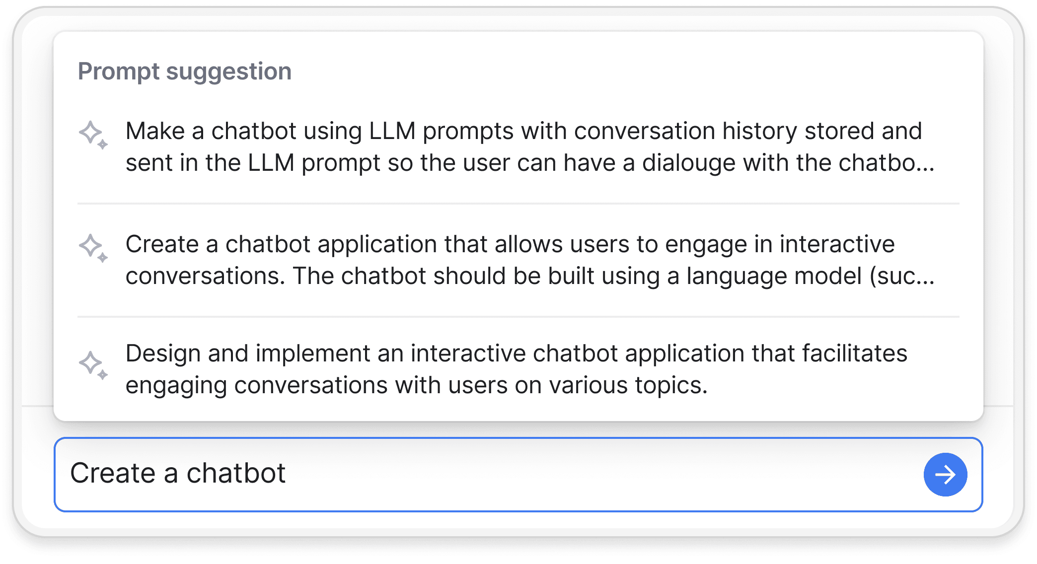
Prompt suggestions reduced blank-state friction during app creation
Improving project navigation and discoverability
Problem
Users couldn't find or perform basic tasks like renaming a project, which undermined confidence early in the experience.
Recommendation
We made common actions more visible and intuitive in the UI, and also enabled them through prompting — so users could accomplish tasks the way that felt natural to them.
Expected outcome
Reduce early friction and give users more than one path to complete basic tasks.

"Edit app info" button added to make project renaming visible and accessible directly from the app overview
Influencing product decisions
Problem
Decisions were being driven by internal assumptions rather than observed user behavior.
Recommendation
I introduced recurring usability testing and shared findings directly with the team to guide prioritization discussions.
Expected outcome
Shift the team's decision-making process from assumption-based to evidence-based.
Testing & iteration
Usability testing was not a one-time exercise — it became a continuous loop throughout the product's development.
After each round of sessions, findings were synthesized and shared with the team. Recommendations that were implemented were then re-tested in subsequent sessions to evaluate whether the friction points had been resolved or had shifted.
Rather than relying on formal metrics, I assessed progress by observing whether users could move through previously problematic flows without getting stuck. When a friction point no longer appeared consistently across sessions, I introduced new areas of the experience into the testing cycle.
This iterative approach also surfaced evolving user expectations and new friction as the platform grew, ensuring that research remained relevant rather than becoming a one-off deliverable.
Outcomes
Over 6 months, I conducted more than 60 usability sessions across new users, beta testers, and public users — establishing a continuous research practice where none had existed before.
The results supported our initial hypothesis:
Simplified terminology and clearer feedback reduced onboarding friction for non-technical users
Users reached expected outcomes with fewer prompt iterations after guidance and feedback improvements were introduced
Core features became easier to find and understand, improving discoverability throughout the platform
Research findings directly influenced product prioritization, shifting team discussions from internal assumptions to validated user behavior
Reflection
This project reinforced the importance of introducing continuous user validation early in fast-moving AI product environments.
Observing how users interpreted prompts, feedback, and system behavior revealed recurring gaps between internal technical assumptions and real user expectations.
It also highlighted how usability in AI products goes beyond interface design — the system itself needs to help users build confidence and a clear mental model throughout every interaction.