2026
Rethinking the Barcelona Metro Ticket Machine
Role
Timeline
1 week
Team

Scale of the problem
Daily riders
Riders on Barcelona's metro daily
Annual journeys
Combined metro + bus journeys in 2025
Annual visitors
Visitors to Barcelona per year
Context
The TMB ticket machine handles a huge range of decisions in a very small space: over a million riders a day, plus millions of tourists a year who've never used it before, often deciding what to buy under time pressure and in a second or third language.
Despite that scale, common purchases surface avoidable friction — ticket types buried behind an extra tap, zone selection that comes down to guessing, and a payment area that's easy to misread in the moment.
This case study is grounded in the actual TMB machine — photographed, tested, and compared against five other transit systems (Paris Navigo, DB Bahn, Madrid, Minneapolis Metro Transit, and the Barcelona tram) — rather than a hypothetical redesign.
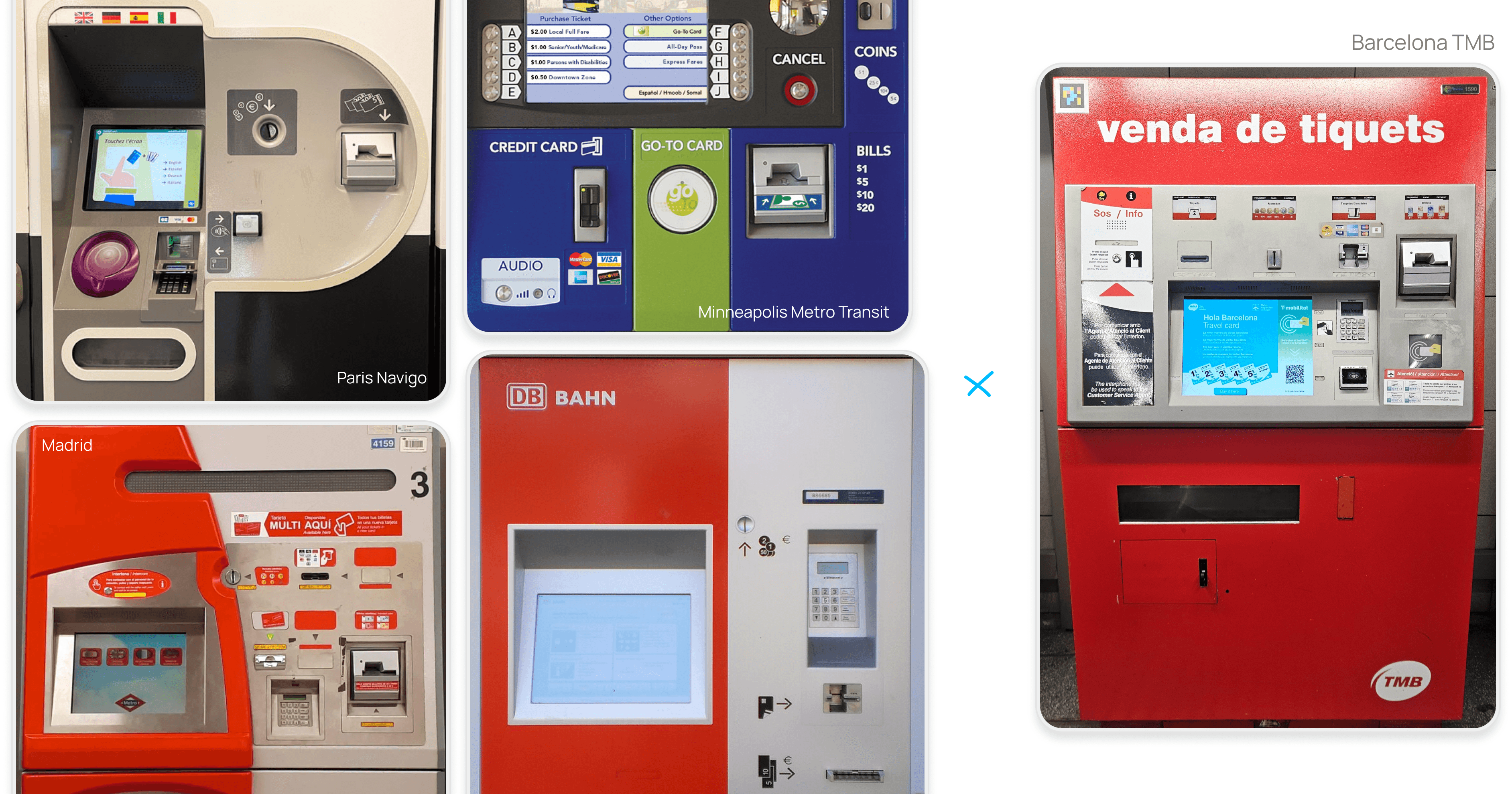
Benchmarked against other transit ticket machines before redesigning Barcelona's
Research
Ridership figures, tourism board statistics, and travel-forum complaints helped size the problem. Travel guides steer tourists toward the pricier Hola Barcelona card over T-casual mainly because it's clearer about what it includes. Some tickets don't cover the airport line, with only a discreet warning before purchase — travelers can end up buying a second ticket at the gate.
From using the machine myself: the T-mobilitat tap is easily mistaken for contactless payment, the airport ticket is hidden behind an "Others" page, and picking the right number of zones is often just a guess.
A few questions came up while I was doing this research that I couldn't fully answer alone. If I had a research team, these are what I'd bring to them to help sharpen the decisions — a few of them below:
What are the most purchased ticket types, and does that vary by machine location (city center vs. airport-adjacent)?
What do people most often ask for help with via the SOS/Info line?
What share of transactions are new purchases versus collecting a ticket already bought online?
How do blind or low-vision travelers use this machine today — is there a non-visual path, or does accessibility depend entirely on asking for help?
Problem definition
Problem
The physical layout doesn't reflect how it's used — payment methods are scattered, the SOS/Info area over-explains something meant to be urgent, and the T-mobilitat tap isn't clearly distinguished from card payment. The screen hides important information rather than surfacing it.
Hypothesis
Showing the most critical information upfront — on screen and on the machine — would make the process easier for any type of user.
Direction
Four principles guided the redesign: surface what travelers actually need, make zoning legible on the machine itself, fix the T-mobilitat tap's placement, and declutter. I applied them to one complete flow, T-casual, end-to-end — a deliberate trade to make something genuinely finished possible in a week, rather than covering every ticket type thinly.
Key design decisions
Ticket type screen
Problem
The airport ticket was buried behind "Others," Hola Barcelona dominated the screen, and tickets were shown as card photos with no price until later in the flow.
Decision
Reinstated the airport ticket on the main screen, kept Hola Barcelona visible without letting it dominate, and replaced the card photography with clean typography showing name and price upfront.
Expected outcome
Fewer missed tickets, pricing visible from the first decision.
Texto
Zone selection
Problem
Travelers had to guess their zone count or look it up elsewhere.
Decision
Added a destination lookup in the flow — search or pick from popular destinations, with a full zone map available.
Expected outcome
Fewer wrong-zone purchases, less reliance on guessing or asking for help.
Texto
Review and payment
Problem
Both screens were cluttered, and the card fee appeared with no explanation.
Decision
Redesigned both to be more scannable and decluttered, and added a clear explanation of the card fee.
Expected outcome
Faster scanning of price and payment status, no confusion about the fee.
Texto
The machine itself
The physical casing needed the same decluttering as the screens: grouping payment methods (card, bills, coins) together instead of scattering them, moving the T-mobilitat tap to a more sensible spot closer to the screen, and stripping back the photography, illustration, and text competing for attention. The screen should carry the clarity, not the casing around it.

Working through where each element should sit before landing on the final layout
Reflection
The goal was a clearer way to present information — visible pricing, less visual noise, a straightforward path to zoning — alongside a Hola Barcelona placement that still serves TMB's commercial goal without hurting usability for regular commuters. Scoping to one complete flow rather than every ticket type is what made that possible in a week; other flows, error states, and multi-language copy are the natural next steps with more time.
None of this would have fit into a week without AI as a working partner — faster research, a wider set of directions to react to, and "validating" ideas along the way. Real user validation would always be better, but it isn't realistic solo in a week, and AI-assisted reasoning was a genuine substitute within that constraint. It also helped push the screens to a more finished state than a first-pass mockup.